Imagine a story that levels up just like a video game. That’s exactly what happens in the anime Solo Leveling. But not only does the main character become stronger—the visual design evolves too. And that’s what makes this series so special.
Game-Like Storytelling Through Design
Solo Leveling follows Jin-Woo, a weak and almost invisible young man. One day, he receives a mysterious “quest” that allows him to level up in real life like a character in a role-playing game (RPG). With each victory, he gains experience, new skills, and power. But here’s the twist: it’s not just told through words. The story is built through visuals.
When Jin-Woo gains something, we see a glowing screen pop up—just like a video game HUD. This isn’t random; it’s a deliberate design choice to make viewers feel connected to the character’s journey. Visual storytelling makes abstract ideas like growth and power feel tangible.
Color as Emotion and Evolution
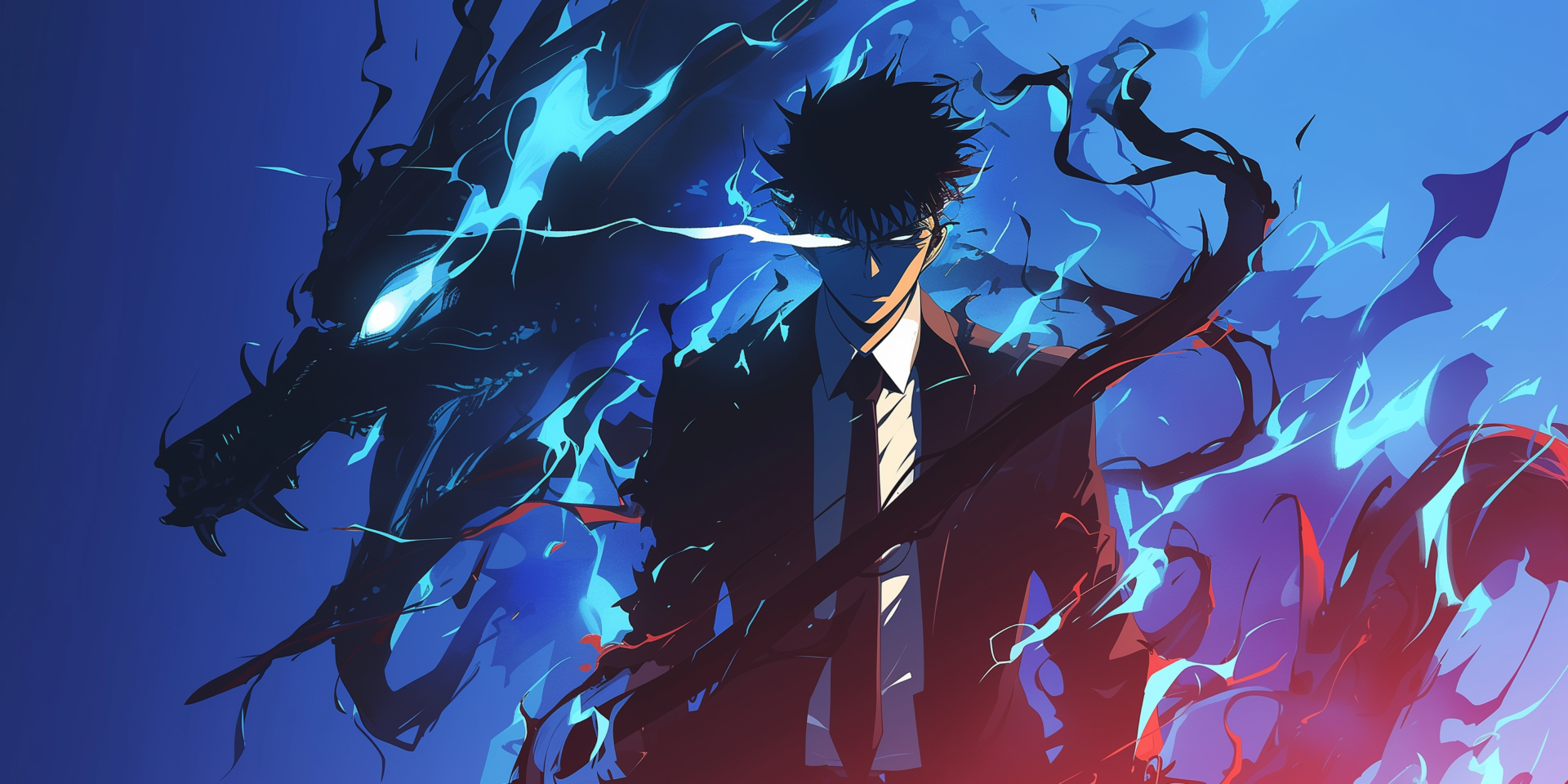
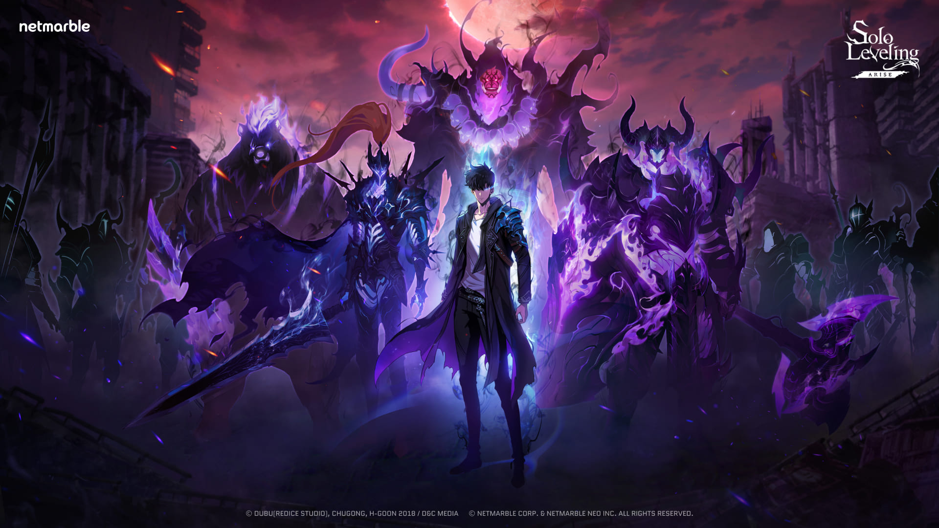
At the beginning, the world of Solo Leveling is painted in cold, muted colors—because life feels dull and hopeless for Jin-Woo. As he levels up, the visuals change. Lighting becomes dramatic. Shadows deepen. Bright effects light up the screen. The world evolves with the character, showing us that design can express emotion and transformation.
Battle Design: Not Just Action, but Art
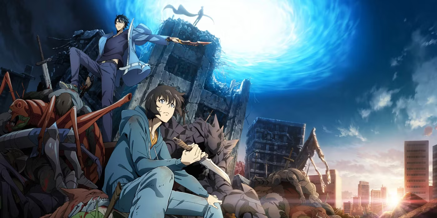
The fight scenes are more than just punches and kicks—they’re a choreography of design. Lines of speed, glowing particles, and color effects make the battles feel alive. Each enemy has a distinct visual language—some look like smoke, others like stone or fire. Designers crafted these aesthetics to trigger specific feelings: fear, awe, curiosity.
Typography, Interfaces, and Immersion
Even the text in Solo Leveling plays a role. The fonts used in system notifications feel high-tech, matching the tone of the show. The interface design borrows from RPG video games: stat windows, quest logs, skill trees. These familiar visuals make the viewer feel immersed—as if they’re part of Jin-Woo’s evolution.
Visual Growth of the Protagonist
Jin-Woo’s appearance reflects his development. At first, he’s hunched over, wears simple clothes, and has a soft gaze. As he grows stronger, he stands tall, wears darker clothing, and gains a glowing aura. His shadow becomes a character itself—what better way to show power than to animate even the darkness around you?
From Webtoon to Animation: Adapting Vertical Storytelling
Solo Leveling originated as a digital comic (webtoon). Its storytelling style is vertical—made for scrolling on phones. The anime respects this structure, with camera angles and pacing that echo that vertical flow. It’s a rare and thoughtful translation of medium to screen.
Design as Narrative, Not Decoration
In Solo Leveling, every visual choice matters. The colors, the movements, the interface—all of it tells the story. Nothing is there just to look pretty. It’s all intentional, designed to help you feel the character’s triumphs, fears, and transformation.
Next time you watch an anime or show, look closely at the details. Why that color? Why that shape? How does movement affect how you feel? Solo Leveling is a reminder that great design isn’t background—it’s part of the plot.